Wiki Boxes
Content
To highlight a section on a wiki page, use the box, rbox, newsbox and
imagebox WikiProcessors:
{{{#!box type align=... width=...
...
}}}

{{{#!rbox type width=...
...
}}}

{{{#!newsbox
...
}}}

{{{#!imagebox
...
}}}
For shorter content, macro syntax may be preferable:
[[box(..., type=..., align=..., width=...)]]

[[rbox(..., type=..., width=...)]]

[[newsbox(...)]]

[[imagebox(...)]]
Following sections demonstrates each box and how to use the parameters.
box and rbox
The normal box looks like this, and is as wide as the page.
box
This is a normal box.
Subheading
Some text
Second Heading 1
Some text
{{{#!box
= box
This is a normal box.
== Subheading
Some text
= Second Heading 1
Some text
}}}
An rbox is aligned to the right of the page, with a fixed width.
rbox
An rbox is aligned to the right of the page, with a
fixed with. Use this for side notes, references etc.
{{{#!rbox
= rbox
An `rbox` is aligned to the right of the page, with a
fixed with. Use this for side notes, references etc.
}}}
Box types
The box type can optionally be stated, either as a flag or as a parameter
type=.... Here are all box types demonstrated. When box and rbox
co-exist, they will share the page width.
configure, configuration, tool
This box is created by the wiki markup
{{{#!rbox configure
...
}}}
See the box description to the left for more details.
details, look, magnifier
critical, stop
bug, error, important, warning
information, note
help, question
tips
chat, discussion, talk
ok, good, yes
bad, no, nok
configure, configuration, tool
White boxes are part of the normal content.
This box is created by the wiki markup
{{{#!box configure
...
}}}
or
{{{#!box type=configure
...
}}}
Alternatively, configuration or tool may be used too, as well as a unique
abbreviation like config.
details, look, magnifier
critical, stop
Red boxes contain some really important information! Pay close attention to these to avoid running into problems.
bug, error, important, warning
information, note
Yellow boxes contain essential, but not critical information.
help, question
tips
comment
Blue boxes contain elaborative information; they are used to elaborate on-going work and should not, ideally, be left behind when work is done.
chat, discussion, talk
ok, good, yes
bad, no, nok
Specify width
Use the width parameter to set the width of the box:
Small box
{{{#!box width=6em
Small box
}}}
Use width=auto to auto-size right-aligned boxes:
Auto-sized rbox
{{{#!rbox width=auto
Auto-sized rbox
}}}
(width=auto does not have this effect on box since this is the default
width for it, which is the whole page width.)
Center-aligned box
Boxes can be center-aligned too. Default width is always auto, which causes
the box to become as narrow as possible.
Center-aligned box
{{{#!box align=center
Center-aligned box
}}}
Define width, or apply a custom style, for widening the centered box.
Width:
Center-aligned box with defined width
{{{#!box align=center width=14em
Center-aligned box with defined width
}}}
Custom style:
Center-aligned box with no white space
wrapping
{{{#!box align=center style="white-space:nowrap"
Center-aligned box with no white space\\
wrapping
}}}
Left-aligned box
Left-aligned box
Boxes can be left-aligned too, text will flow to the right of it. The width
will adapt to its content (i.e. default width is auto).
{{{#!box align=left
Left-aligned box
}}}
Custom styling
Customizable
You can also apply some custom styling to text boxes.
{{{
#!box type=config style="background-color:white; border:2pt inset gray; max-width:350px; border-radius:0; box-shadow:none"
= Customizable
You can also apply some custom styling to text boxes.
}}}
newsbox
A newsbox is very simple to use.
Headline
A newsbox is aligned to the right of the page,
with a fixed with. Use this for announcements etc.
{{{#!newsbox
= Headline
A `newsbox` is aligned to the right of the page,
with a fixed with. Use this for announcements etc.
}}}
A newsbox accepts the same parameters as an ordinary box, but are normally not used.
imagebox
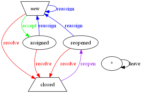
Use the imagebox to show a single image with caption.

Original ticket workflow
{{{#!imagebox
[[Image(htdocs:../common/guide/original-workflow.png, border=1, link=)]]

Original ticket workflow
}}}
An imagebox accepts the same parameters as an ordinary box, but are normally not used.
Macro syntax examples
The macro syntax may be preferable for shorter content:
A short comment
[[rbox(A short comment)]]
The type can be set as a parameter:
A short comment
[[rbox(A short comment, type=comment)]]
Alignment too:
[[box(Learn how to use boxes, align=center)]]
Learn how to use boxes
Finally, width as well:
Auto-sized rbox
[[rbox(Auto-sized rbox, width=auto)]]
Macro instructions
Here follows the built in macro instructions concerning boxes, as they appear on WikiMacros.
[[box]]
View wiki text in a box.
Syntax:
{{{#!box type align=... width=...
wiki text
}}}
or preferably when content is short:
[[box(wiki text, type=..., align=..., width=...)]]
where
typeis an optional flag, or parameter, to call for attention depending on type of matter. Whentypeis set, the box is decorated with an icon (except fornews) and colored, depending on what urgency the type represents:
Urgency (box color) type warn (red) bug,critical,error,important,stop,warninghighlight (yellow) help,information,note,question,tipselaborate (blue) bad,chat,comment,discussion,good,no,nok,ok,talk,yesnews (green) newsnormal (white) configuration,configure,details,look,magnifier,tool
typemay be abbreviated as long as the abbreviation is unique for one of the keywords above.
alignis optionally one ofright,leftorcenter. Therboxmacro is an alias foralign=right.widthis optional and sets the width of the box (defaultsautoexcept for right aligned boxes which defaults a fixed width).widthshould be set whenalign=centerfor proper results.
Examples:
{{{#!box warn
= Warning
Beware of the bugs
}}}

[[box(Beware of the bugs, type=warn)]]
A style parameter is also accepted, to allow for custom
styling of the box. See also the rbox, newsbox and
imagebox macros (processors).
[[imagebox]]
Present a centered box suitable for one image.
Syntax:
{{{#!imagebox
wiki text
}}}
This box is typically used together with the Image macro:
{{{#!imagebox
[[Image(file)]]

Caption
}}}
Note that the size parameter of the Image macro may not
behave as expected when using relative sizes (%).
The following parameters are also accepted:
align— One ofright,leftorcenter(defaultscenter).width— Set the width of the box (defaultsautoexcept for right aligned boxes which defaults a fixed width).style— Custom styling of the box.
See also the box, rbox and newsbox macros (processors).
[[lbox]]
View a left-aligned box. (This is a shorthand for
box align=left)
Syntax:
{{{#!lbox type width=...
wiki text
}}}
or preferably when content is short:
[[lbox(wiki text, type=..., width=...)]]
where
typeis an optional flag, or parameter, to call for attention depending on type of matter. Whentypeis set, the box is decorated with an icon (except fornews) and colored, depending on what urgency the type represents:
Urgency (box color) type warn (red) bug,critical,error,important,stop,warninghighlight (yellow) help,information,note,question,tipselaborate (blue) bad,chat,comment,discussion,good,no,nok,ok,talk,yesnews (green) newsnormal (white) configuration,configure,details,look,magnifier,tool
typemay be abbreviated as long as the abbreviation is unique for one of the keywords above.
widthis optional and sets the width of the box (defaults a fixed width). Usewidth=autofor an automatically sized box.
Examples:
{{{#!lbox warn
= Warning
Beware of the bugs
}}}

[[lbox(Beware of the bugs, type=warn)]]
A style parameter is also accepted, to allow for custom
styling of the box. See also the box, newsbox and
imagebox macros (processors).
[[newsbox]]
Present a news box to the right. (This is a shorthand for
rbox news)
Syntax:
{{{#!newsbox
wiki text
}}}
The following parameters are also accepted:
width— Set the width of the box (defaults a fixed width).style— Custom styling of the box.
See also the box, rbox and imagebox macros (processors).
(Comment: This box corresponds to the well-known
NewsFlash macro.)
[[rbox]]
View a right-aligned box. (This is a shorthand for
box align=right)
Syntax:
{{{#!rbox type width=...
wiki text
}}}
or preferably when content is short:
[[rbox(wiki text, type=..., width=...)]]
where
typeis an optional flag, or parameter, to call for attention depending on type of matter. Whentypeis set, the box is decorated with an icon (except fornews) and colored, depending on what urgency the type represents:
Urgency (box color) type warn (red) bug,critical,error,important,stop,warninghighlight (yellow) help,information,note,question,tipselaborate (blue) bad,chat,comment,discussion,good,no,nok,ok,talk,yesnews (green) newsnormal (white) configuration,configure,details,look,magnifier,tool
typemay be abbreviated as long as the abbreviation is unique for one of the keywords above.
widthis optional and sets the width of the box (defaults a fixed width). Usewidth=autofor an automatically sized box.
Examples:
{{{#!rbox warn
= Warning
Beware of the bugs
}}}

[[rbox(Beware of the bugs, type=warn)]]
A style parameter is also accepted, to allow for custom
styling of the box. See also the box, newsbox and
imagebox macros (processors).

comment